📊 Deconstructing Metrics on Medium
Jul 09, 2018 • 12 min • Data Science
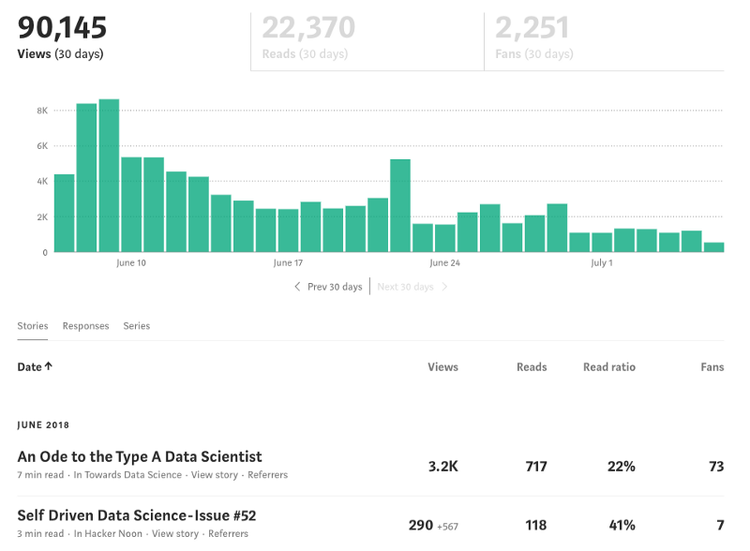
If you’ve ever published a story on Medium before, chances are that you’re familiar with Medium Stats and its offerings. Medium Stats is a tool where you can view traffic and visitor statistics for posts that you publish on the platform. It’s also a tool that is lacking severely.
The feature gives us access to metrics such as Views, Reads, Read Ratio, and Fans for each of their published stories. It also gives cumulative totals for certain metrics over the previous 30 days.
The design of the page has been widely disputed, but the truth is that there’s more work to be done here than just visual improvement. Medium tracks plenty of information that isn’t available within the limited functionality of the page. Furthermore, any functionality that does exist is centered around vanity metrics that struggle to convey the full picture.
The Project
We may not have access to the plethora of metrics being collected, but we do have Medium Stats at our disposal. Maybe there’s actually some meaningful insights buried in there somewhere. Maybe, just maybe…
Is there some way to leverage this data for more useful information than we’re currently being offered?
With this question in mind, I proceeded to collect data from my own Medium Stats page and then perform some exploratory data analysis on any notable relationships and trends across my 30+ previous stories.
If you’re interested in performing similar analysis on your own Medium data, check out the repo linked below. You’ll find my personal dataset available to start with, along with a couple notebooks that should prove useful.
Ever since I started digging around in the data, I began thinking a lot about metrics and what they mean here on Medium.
Throughout this post, I’ll dive into each metric offered by Medium Stats and explore possible alternatives. I’ll also reference insights and questions posed by exploratory data analysis on my previous stories.
A Few Notes on Metrics
The task of creating or selecting new metrics certainly isn’t an easy one. For this reason, we often end up substituting the initial problem with some simplified question that’s more interpretable. There’s plenty of useful heuristics out there, but I often end up breaking things down to the following when thinking about metrics:
1. What does success look like in this context?
2. How can we quantify it?
Due to the subjective nature of the task, analyzing what makes a certain metric ‘good’ or ‘bad’ is often even more difficult. With this being said, there are a few attributes worth mentioning that are typically associated with effective metrics. Here’s a short list to get started with from Plan Brothers:
Comparative
A good metric has to be comparable to time, other equivalent groups, and competitors.
Understood
Create metrics that are understandable. If people can’t remember the details or discuss them, it means the metric is confusing.
Ratio-Based
Every metric should be based on a clear ratio. Think of driving a car. Distance traveled is informational but not actionable. On the other hand, distance per hour is something you can act on.
Behavior Changing
A good metric produces data that informs necessary adjustments and drives action. What will I do differently based on this information?
With these attributes in mind, let’s move onto some analysis. For more on metrics, I highly recommend checking out Julie Zhuo and her various posts on setting metrics. Let’s get started!
Metric #1: Views
Views are a staple when it comes to web-based content. They’re super easy to interpret and pretty damn effective at making us feel good about ourselves. Personally, here’s what my top five most viewed posts looks like:
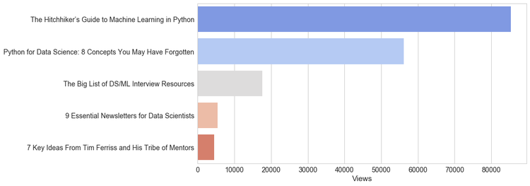
You might notice that the top two stories significantly outshine the others. After further analysis, I found that over 70% of my lifetime views come from just 2 out of my 30+ stories here on Medium. These posts focus on teaching concepts in machine learning and data manipulation by implementing them in Python. I would imagine this is a common theme among writers — not every post is going to be a homerun.
This further speaks to the point that views don’t tell the whole story. If anything, they are measuring the scope of a post ie. how many people it reached. The sheer number of eyeballs on a given story is extremely misleading and often encourages clickbait titles and buzzword-filled descriptions.
Alternate Metric: Shares
One could make the argument that Views can be thrown out entirely. The metric often does more bad than good, causing writers to focus more on drawing attention and less on producing insightful work.
If you need a counting metric to measure the scope of the piece, I recommend using Shares instead. There’s a couple reasons why I think this is an improvement:
- Shares still measure the scope of a post, but also take into account the content since a reader wouldn’t share a post they didn’t enjoy.
- Shares penalize shallow, clickbait pieces rather than reward them.
A possible downside of using Shares is that a repost from a well-known influencer would be weighted the same as someone with less followers.
Whether this is good or bad is up for debate. In the context of quantifying scope, Shares falls short initially and would depend on a chain effect taking place. For example, when someone with 100,000 followers reposts your article on Twitter, it’s initially recorded as +1 share. The extra weight for that particular influential share would have to come in the form of exposure to more readers, who will also have an opportunity to share the post, and so on.
Even taking this into account, I still see Shares as an improvement when it comes to providing meaningful feedback. Even if it’s not a replacement to the ever-faithful Views, as writers are undoubtedly still interested in how many people have seen their stories.
Shares should be offered along with Views when it comes to assessing the true scope and virality of a post.
Metric #2: Reads
Reads does a better job of weeding out shallow posts, since readers may click on them but they likely won’t finish reading once they realize they aren’t getting any value from it.
You probably recall that counting metrics should be generally be avoided. They might be fun to mention to friends or use to boost our egos, but when it comes to driving action, they fall short.
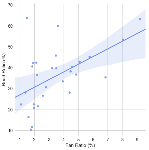
As one might expect, there’s going to be a clear correlation between Reads and Views that clouds any insights we might take from the metric. Note that I’ve removed outliers for a better look at the relationship below:
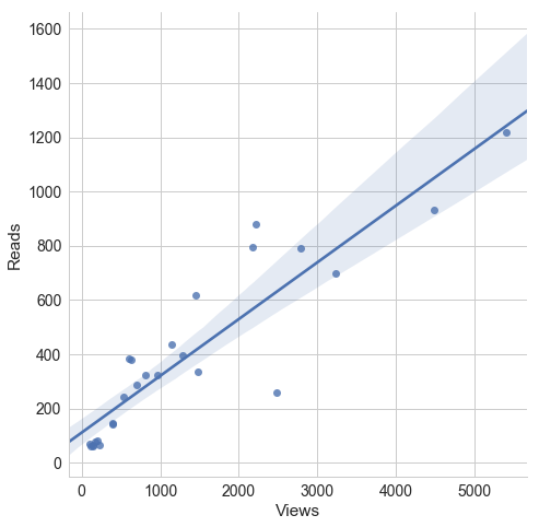
Reads is a little different than Views. While Views was looking to measure scope, Reads is instead focused on engagement. How do people actually engage with the material? This is difficult to answer with a counting metric.
In order to truly capture how engaging a post is, we’ll need to use something more ratio-based. Luckily, Medium already has an answer to this problem.
Alternate Metric: Read Ratio
I won’t go to far into Read Ratio right now since we’ll touch on it much more in-depth later, but let’s go over some notable improvements:
- Read Ratio adjusts for the number of views, eliminating the bias that previously influenced Reads.
- Read Ratio is comparable among most types of posts, no matter the context or popularity.
Read Ratio has proven to be a pretty helpful metric for assessing the readability of my posts. At the end of the day, you can’t deliver value to your readers if you can’t keep them engaged.
Metric #3: Read Ratio
Finally an actionable metric on Medium stats! As we just mentioned, Read Ratio is a more meaningful twist on the traditional Reads count. Furthermore, it can still be easily understood as the percentage of viewers who stuck around and read the post. Let’s check out my top posts on Medium by Read Ratio:
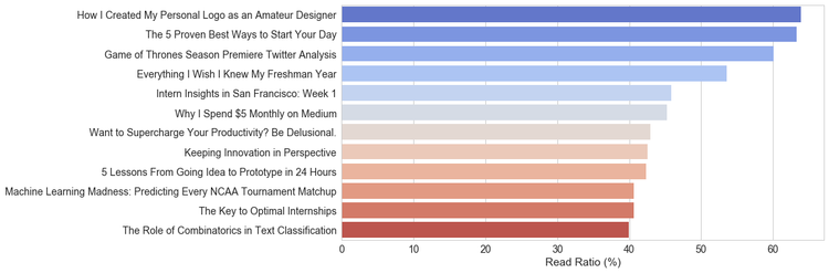
This was super interesting to me. It appears that my very first Medium post ever had the highest Read Ratio. When I went back and reviewed the top stories above, I noticed a theme. Just about all of them were somewhat short; coming in at under 6 minutes Read Time. They also had plenty of pictures and headers making it easy for the reader to skim through.
This seems pretty intuitive, but let’s look further into this hunch by assessing the Read Ratio of posts binned by their respective Read Time.
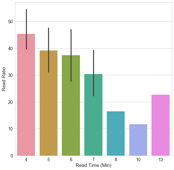
As one might expect, the likelihood of someone reading through a post is largely dependent on the length of the article. This definitely hinders our interpretation of Read Ratio. So let’s fix it.
Alternate Metric: Adjusted Read Ratio
We need to design a way to show users what qualifies as ‘good’ and ‘bad’ relative to other posts around the same length in Read Time. In order to do this, we could normalize the Read Ratios within each Read Time group and report the new score between 0 and 1.
This metric would be a more accurate assessment of how engaging a post is, but it creates a problem with interpretability. There is often trade-offs in choosing metrics; we want to answer the question at hand but we need something that is also easily understood.
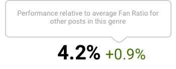
Let’s find a compromise. Note that I’m going to cheat a bit here. This isn’t necessarily it’s own standalone metric, but rather a subtle information design tweak. By adding the relative performance to the already interpretable Read Ratio, the user can deduce a lot more from it.
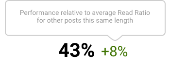
This isn’t earth shattering, but this small change makes a world of difference. Let’s think back to our four characteristics of a strong metric: comparable, understood, ratio-based, and behavior changing.
Originally, Read Ratio was well-understood and ratio-based. However, it lacked comparability and substantial behavior changing power due to bias regarding Read Time.
With this new design, all four bases are covered and writers can easily interpret how engaging their work is relative to its length.
Metric #4: Fans
After a brief success with Read Ratio, we’re back to vanity metrics here. Note that Fans doesn’t tell us the amount of claps, but simply registers each user who claps as a fan. Needless to say there could be more substance here.
With Fans, we’re looking to assess something totally different than we were with Views (scope) or Reads (engagement). We are particularly looking to quantify impact. How much of an impact does the post have? How much do people enjoy it?
In order to improve this metric, let’s keep it simple and take the ratio-based alternative to it. For every person that reads the post, how many of them were impacted enough to clap at least once? The answer is Fan Ratio.
Alternate Metric: Adjusted Fan Ratio
Several Medium users have spoken out about hand-calculating this metric already, so I’m a bit surprised it hasn’t been incorporated into the Medium Stats offerings.
By using Fan Ratio instead of Fans, we get the obvious benefits of using a ratio instead of a count. Most notably, it offers us a metric that’s comparable and contains actionable information. Here’s my top posts for Fan Ratio:
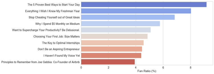
The first thing that I noticed here was that my posts on self-improvement garnered a noticeably better Fan Ratio than my technical posts.
Do certain genres of stories get better Fan Ratios than others?
Luckily, I submit all of my posts to publications based on the topic. Posts on self improvement topics go to The Ascent and The Startup, while more technical posts go to Towards Data Science, freeCodeCamp, and Hackernoon. Finally, any design-related posts typically are submitted to UX Planet.
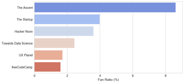
While based on a small sample size of ~30 stories, this appears to confirm our suspicion that some genres perform better than others. Then again, by introducing publications, it could simply be that some publications have more engaged users than others. It’s hard to answer this question definitively without more data, however my gut tells me to go with the first option: genre.
This makes sense to me intuitively. Particularly when it comes to the performance of self-improvement posts. They seem to be the most popular on Medium by a long-shot and often attract plenty of fans. Many of them can be targeted at anyone in any situation and thus are more likely to positively impact someone and create a fan.
Medium could even take this a step further by clustering similar posts using other content-based features in order to create a profiling system.
Instead of comparing the Fan Ratio of a post to others in its genre, it could be compared to other posts in its cluster for a more accurate representation of its true, relative strength.
A Better KPI
After plenty of thought and analysis, I’ve found that a successful post on Medium generally has the following attributes:
- It engages readers, keeping them interested enough to finish reading.
- It positively impacts readers, providing some value or enjoyment.
We’ve touched on a lot of different metrics and insights in this post, but it’s really that simple. You bring readers in and you provide them with value.
As we noted earlier, we can measure engagement with Adjusted Read Ratio and impact with Adjusted Fan Ratio. Luckily, these two factors seem to be fairly strongly related with a 0.54 correlation on this particular sample.
It’s good to see a somewhat linear relationship here, meaning that strong posts typically do well in both Read Ratio and Fan Ratio. With this in mind, I considered a few possibilities for normalized and weighted averages culminating in one all-encompassing metric, but I opted against this for interpretability.
“When human judgment and big data intersect there are some funny things that happen” — Nate Silver
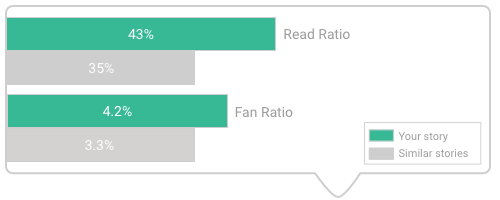
If I had things my way, I would offer something similar to the visualization below when you mouse over a specific post. As we explored earlier, this provides a better representation of the effectiveness of a given post while remaining both interpretable and comparable. Engagement and impact.
Final Words
Congrats if you stuck around this long! I could’ve never anticipated this project transitioning from a brief exploratory data analysis to a 2,600 word deep-dive on metrics. However, I do have one last point to make.
We know how powerful data is. We know that it can be useful for almost any context out there — yes, including writing. Companies are supposedly becoming more and more data-driven every day.
So when does this movement hit Medium’s platform for writers?
This type of analysis should be available to all writers, not just data science enthusiasts and practitioners. We need to democratize data analysis for content creators. These insights were possible with a 30 post sample size taken off of one Medium Stats page. Imagine the possibilities with more data and information at our disposal.
By empowering writers to analyze their content and understand how readers perceive it, they will produce better work with more impact.
It’s no small task, but I believe it’s well within reach. Your move, Medium.
Thanks for reading! If you enjoyed this post and you’re feeling generous, perhaps follow me on Twitter. You can also subscribe in the form below to get future posts like this one straight to your inbox. 🔥